 |
| #19 |
Pros: None.
Cons: I have no idea what is going on with this. Are those trees?
 |
| #18 |
Pros: Shiny.
Cons: Lacks context. Looks too complicated, as if you could cut yourself. Unclear how "it works." No people to be found.
 |
| #17 |
Pros: Dramatic stormy sky includes both auburn and gunmetal gray.
Cons: Devoid of human life. What are those giant white cones that look like flocks of birds? Too much yellow on the field.
 |
| #16 |
Pros: Recalls 16th c. Tokugawa-era armor pattern.
Cons: Over-saturated color palette. People too small. Lighting lacks complexity. Recalls insects.
 |
| #15 |
Pros: Wood paneling on the side of the stadium is a nice touch, adds the impression of texture.
Cons: Foreground too dark. Streetlamps insufficiently
elegant. Giant glass screen too busy, unclear. Trees inaccurate for
upper Midwestern climate. Stoplight without cars unrealistic.
 |
| #14 |
Pros: Nice use of city skyline in background as a horizon. Highly dramatic skyscape. Nice use of purple.
Cons: Purple is an ugly color. Spotlights too even. Conic
sections repetitive. Giant banners look like the scene from Lord of the
Rings where the orcs attack. Are those cars or turtles?
 |
| #13 |
Pros:
Dramatic mixture of internal and external stretches perceptual
categories. Backlit skyline. Semi-accurate depiction of skyscrapers.
Flashes in the audience are nice touch.
Cons: Over-saturated green on field. Needs clearer definition between urban skyline and building. Too stark of contrast between field and non-field.
 |
| #12 |
Pros: Many humans.
Cons: Man in brown coat too prominent. Too much
"ultra-realistic" detail of Vikings fans suggest actual experience of
Vikings game, may lead to unpleasant memories. Stadium looks like
generic corporate office park. What is that yellow thing? Is that green
blob a tree? What is that white arch thing? Is it made out of glass?
What is that purple stuff next to it? Is it bunting? Why bunting? Purple
is an ugly color.
 |
| #11 |
Pros: Cathedral-esque lighting! Very dramatic, recalls the Strasbourg Cathedral.
Cons: Are they playing soccer? Strike one, two, and three! (Oops, that's baseball.) Sacked in the endzone for a safety!
 |
| #10 |
Pros: Focus on tailgating places social activity at the center of the frame.
Cons: Too busy! Very difficult to distinguish foreground
from background. Lack of diversity in banners leads to repetitive eye
strain. "Minnesota sports complex" too generic sounding, suggests
bureaucracy. Purple is an ugly color. Why the red Toyota?
 |
| #9 |
Pros: Color / edge style suggests watercolor. Fanciful. Light palette recalls religious depictions of heaven.
Cons: Strange placement of roof support. Unclear how building stays upright. Where are the walls? Soft lighting suggests The Rapture.
 |
| #8 |
Pros: High overhead angle gives broad perspective. Pointillist style suggests French Impressionism. Nice strong geometric form. Realistic depiction of freeway infrastructure.
Cons: Horizon not level. Lack of detail is alienating. Stadium infinitesimal. Repetitive abstract lines suggest agriculture, not violent professional sports. Muted color palette.
 |
| #7 |
Pros: High angle offers perspective, places stadium in context. Nice use of gradient fade.
 |
| #6 |
Pros:
Pencil sketch cross-hatching gives rendering a hand-made quality,
suggests humanity of artist. Semi-accurate depiction of urban spatial
context. High angle hides height of buildings.
Cons: Flags too large. Lack of detail. Football stadium not emphasized. Lacks depth.
Cons: What stadium? Vikings fans enjoying wintertime landscape is unrealistic. Lack of detail makes it unclear what activities are taking place. Shadows too realistic, recall actual coldness of winter. |

 |
| #4 |
Pros: Delicate external bracing adds lightness to architecture. Semi-transparency gives illusion of depth. Trees are plentiful. Nice cirrus cloud renderings.
Cons: Strange topography gives stadium an unbalanced effect. Curvature induces queasiness. Could this building even exist?
 |
| #3 |
Pros:
Emphasis on oft-overlooked wetlands is daring maneuver. Nice use of
balloons. Partially clipped dirigible! Realistic depiction of Vikings
fan's waistlines.
Cons: What are
those yellow things? Over-saturated color palette suggests mid-90s
computer software. What are those yellow things? Use of jorts a bit too
"realistic" for utopian fantasy. What is that purple thing? Are those
seats? Purple is an ugly color.
 |
| #2 |
Pros: Almost Brutalist latticework provides stark realism, gives (really quite daring) impression of being trapped, imprisoned within a Viking-filled cage. Tiny glimpse of city is a striking artistic decision suggesting possibility of freedom.
Cons: Field looks tie-dyed. Bunker connotations unhelpful. Freedom possibly illusory. Could be façade, like The Matrix.
 |
| #1 |
Pros:
Excellent balance between infrastructure and social activities.
Symmetry between restaurant and stadium. Purple scoreboards offer strong
horizontal line demarcating foreground and background. Everyone likes
skating.
Cons: Unclear structures. Stadium looks like Sydney Opera
House crossed with an alien spaceship. Outdoor plaza in winter
unrealistic given Minnesotan tendencies to prefer indoor malls. Purple is an ugly color. Pollution along horizon?
Update: And a late entry takes the GRAND PRIZE!
Pros: Everything!
Cons: None.
Update: And a late entry takes the GRAND PRIZE!
Pros: Everything!
Cons: None.
13 comments:
Awesome post! I look forward to next year's top renderings list, after a bunch are added to the list of possibilities this year. Will the Opera House/Spaceship be able to hold on to number 1?
I agree purple IS an ugly color. Bright yellow isn't too much better. Hmmm.....
Brilliant rendering analysis Bill. #2 almost looks Piranesian. Maybe there's some way to roll the Vikings Stadium into the prison industrial complex?
Wow Peter. Excellent observation. The stadium looks a lot like Piranesi's famous imaginary prisons!
http://oldschoolheretic.blogspot.com/2010/12/hey-piranesi.html
The parallels here are profound. Both are imagined spaces, made impossibly complex. Both link to Kafkaesque bureaucratic machinations.
Actual link is here.
I like purple. Also, we have missed the all time greatest rendering. When the Humpty dome was first proposed, to just as much of a political fight as this one by the way, Dome and weather were big issues (the compromise was no air conditioning, and we all died in there until they added it!). The April 1 MN Daily campus paper had a phony April Fools newspaper wrapped around the real paper. In it was an artist's rendering of a propsed compromise underground dome! IT was the greatest. PS The Fake Daily Headline read, RESERVE MINING LINKED TO EDMUND FITZ SINKING
@Jring that all sounds amazing! I want images. hard to imagine dome w/out A/C.
(PS your opinion about purple is invalid.)
You forgot my all-time favorite, the Metrodome renovation proposed back in 2001. http://news.minnesota.publicradio.org/features/200112/18_khoom_stadium/
its like someone just took a pair of scissors to that thing.
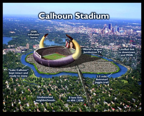
Very interesting. Calhoun Stadium is impressive, except its made to look stupid with the picture of Michele bachman on the jumbo-tron. Put a Viking on it, and it will improve 10 fold.
Thank you for providing such great info and service. More power to you!
Very funny. Very cool. I love the running purple commentary.
Dude...... Open your eyes Minnesota people love the outdoors! This includes the long winter months. Also, to rip on the color purple in Minnesota is as bad as ripping on the red white and blue in the nations capital....... I think you need to go back to the Guthrie and discuss your opinions with like minded people
Post a Comment