2015-01-29

Saint Paul's Big Day Shows the Fundamental Problem with Cars in Cities

Last Saturday was a great day in Saint Paul. I’ve written before about why I like events like Crashed Ice despite the crass commercialism inherent in transforming your city’s hallmark religious building into a giant logo for a horrible energy drink. And on Saturday, as the Winter Carnival Parade, the Crashed Ice race, a double-feature of Prairie Home Companion, and hockey things were going on simultaneously, Saint Paul felt as alive as I’ve ever seen it, full of people, activity, diversity, and surprise. It was great to walk around!

But as is often the case, the experience led me to dwell on the fundamental difference between walkable cities and a car-based society. Try as we might to reconcile the various “modes” of urban movement, the difference between driving a car and doing just about anything else all comes down to density. Put simply, in a car, more is bad; outside of a car, more is good.

[I made a helpful graphic.]


It’s relatively simple to understand. Just look at any car commercial, showing people driving their shining new SUV through a city street. The one common denominator is that in almost every case, the streets are practically empty. The ideal state for driving a car is to be completely alone, to have the city all to yourself.


Now think about any commercial that shows people walking around a city. Typically, you’ll see streets full of other people, maybe dogs, shops, street vendors. The ideal city on foot is full of other people.


You just can’t get around that fundamental opposition. Cars transform us all into misanthropes.

[Please sir, I want some more.]
And it’s really a shame. Last Saturday, I found myself riding the Green Line train with a serendipitous friend. Because of all the activity, the train was full of people, and I found myself chatting with a man sitting on the next seat. He visiting Saint Paul from Tennessee just to see Garrison Keillor perform before he retired. Before you know it, I was giving him directions to the Fitzgerald Theater, and then helping another couple find the Great Waters Brewery. There were families, strollers, people from all over the country all taking the train through Saint Paul.

Getting off and riding my bike down West 7th Street, I happened across the Winter Carnival Parade, then headed for the Original Coney Island for the first hot dog they’ve served in 30 years (one of Saint Paul’s many shuttered businesses). Later, the thrift store, a walk through the Crashed Ice, a quick tour of the Cathedral's interior, and a walk down the street to a friend’s party on Cathedral Hill.

Everywhere I went, there were people on the street. The city was so much more alive than it usually is. And because I wasn’t driving, I could enjoy it.


2015-01-28

Signs of the Times #100 (Best of Edition)

In celebration of the 100th edition of the Signs of the Times, here are collected for you some of my all-time favorites:


Here's an example of a nice ironic sign, taking an existing signage trope and playing with it. Nicely done.


A similar attempt here, but obviously much more earnest. Again, using humor to make a point and share an experience with the public.


 I like signs like this because they transport you into a different world. You realize that there are multiple ways of living a life, and in one of them you make fortune cookies.


A nice sign that must be one-of-a-kind. Props for the excellent giant iguana icon.


 Another sign that transports you into another world. Hard to believe this was real, but one must assume that whoever was holding this sign somehow got to Milwaukee.

 This falls under the category of 'signs that tell you things that ought to be obvious.' For example, there are many signs explaining to people how to use doors. Rarely do you see public signs relating directly to mouths.

 A sign under the DIY category, a lovely marriage of hand-made signage and technology. This sign somehow makes surveillance cozy.

 Another 'explaining the obvious' sign.
 
 There are certain signs that are extremely earnest. You get the feeling that the person who made these signs is desparate to tell a story, and that this is the best they can do. The unplanned topography with the '-ed' crammed in there is also an example of an evolving sign, where the editorial modifications are apparent on the surface.


Another 'another world' sign. In this world you buy live pheasants.


Explaining the obvious. Anytime cities have to deploy signs like this, they've designed something terribly wrong. 

Falls under the category of 'cute intervention' signage. There are many such examples, but this is one of my favorites for its simplicity, font, and placement on the #3 route schedule. 


 Typographic modification of a classic.

 Checks two boxes: both a edit-palooza and an 'obvious dumb design' sign.

 Cute modification signage from Portland. Nice that they attempted to mimic the existing typographical conventions.


One of the many earnest political signs from Midway Books, surely one of the most noteworthy signage campaigns in Saint Paul history. He may have lost the war, but he made great signs.

 An example of a store moving sign, but so beautifully done that you just want to go get your haircut.


Many signs relate to dogs (e.g. their poo). This is one of the coolest. 

 Beautiful DIY sign here, though I think some of the strange lettering effects might be accidental.


 One of my all-time favorites, a DIY stop sign from the Cedar-Riverside area. I think this street is technically one-way, but many people don't regard it that way.


 A great example of the 'accidental poetry' sign, combined with the 'entropic decay' category. We could all use a relaxing.


Poetic DIY signage combined with the 'slow down' category. Clearly an artist doing something nice for their neighborhood. There are lots of signs like this in South Minneapolis, many of them with elliptical statements. This is my favorite, because there are so many potential meanings.


Another accidental poetry sign. You just want to go in there and become your best self.


One of the most earnest examples of declaration signage that I've ever seen is this one from old Mendota all about Kelo vs. New London.


 Intentionally so, but mysterious. "Please be careful of letters in the wind." The answer might be blowing in there, I suppose.


 Call out signage, rare because it names names. This is from Southern Minnesota.


A typo on the classic garage sale sign. Most typo signs revolve around "your" vs "you're", so this one is fun. 


No thank you. Were they thanking all the societies in turn? Who can say, but it's a lovely sentiment.


A great sign here. Hair cut places have the best names, and this was one during the LRT construction detour period. But it's nice and horrifying to imagine a world where infinite hair did exist in the alley behind University Avenue.

Another classic signage category is the 'lost/found/stolen' flyer. This is one of the best I've ever seen, though I doubt she got her laptop back.

A great slow down sign, which also makes claims about neighborhood identity. I like that; let's do more of that.

An example of the classic storefront 'sandwich board'. Most of these try too hard. All you have to do is open up a line of inquiry, as this does.


 A sign-eating tree. I love this so much. What if all trees contain ancient signs?


 Another classic sign category is the 'now closed' or 'moving' announcement. This is my favorite. "Abandon Kansas is canceled!" I guess we're all going to have to stay there, I suppose.


Most signs are improved by a drawing. This is a great drawing, though I doubt ferrets can be "nice."


Another great drawing + typography example of the classic garage sale sign.

 Wonderful sign.

 Great evolving edit sign from Saint Paul's West 7th Street.


Beware of Doug. 

 A poetic dump truck from Milwaukee. If only all businesses were so up front about their inner angst.

 Accidental typo poetry. Good to know for those of you in anticipation.

 A sad sign from Hinckley, but fortunate that so many things begin with 'b'.

 Somewhere out there someone is making a bunch of signs for small University Avenue businesses, because this lettering style looks familiar. This is the best of them.

 A great DIY sign here.

My favorite poetic accident of the year.

2015-01-23

*** Sidewalk Weekend! **

Sidewalk Rating: Suspicious

That which is energetically advantageous is that which will sooner or later happen. In one sense a structure is a device which exits in order to delay some event which is energetically favored. It is energetically advantageous, for instance, for a weight to fall to the ground, for strain energy to be released -- and so on. Sooner or later the weight will fall to the ground and the strain energy will be released; but is is the business of a structure to delay such events for a season, for a lifetime or for thousands of years. All structures will be broken or destroyed in the end -- just as all people will die in the end. It is the purpose of medicine and engineering to postpone these occurrences for a decent interval. The question is: what is to be regarded as a 'decent interval'?


[High above Saint Paul.]


*** CLICK ON IMAGES FOR LINKS! ***
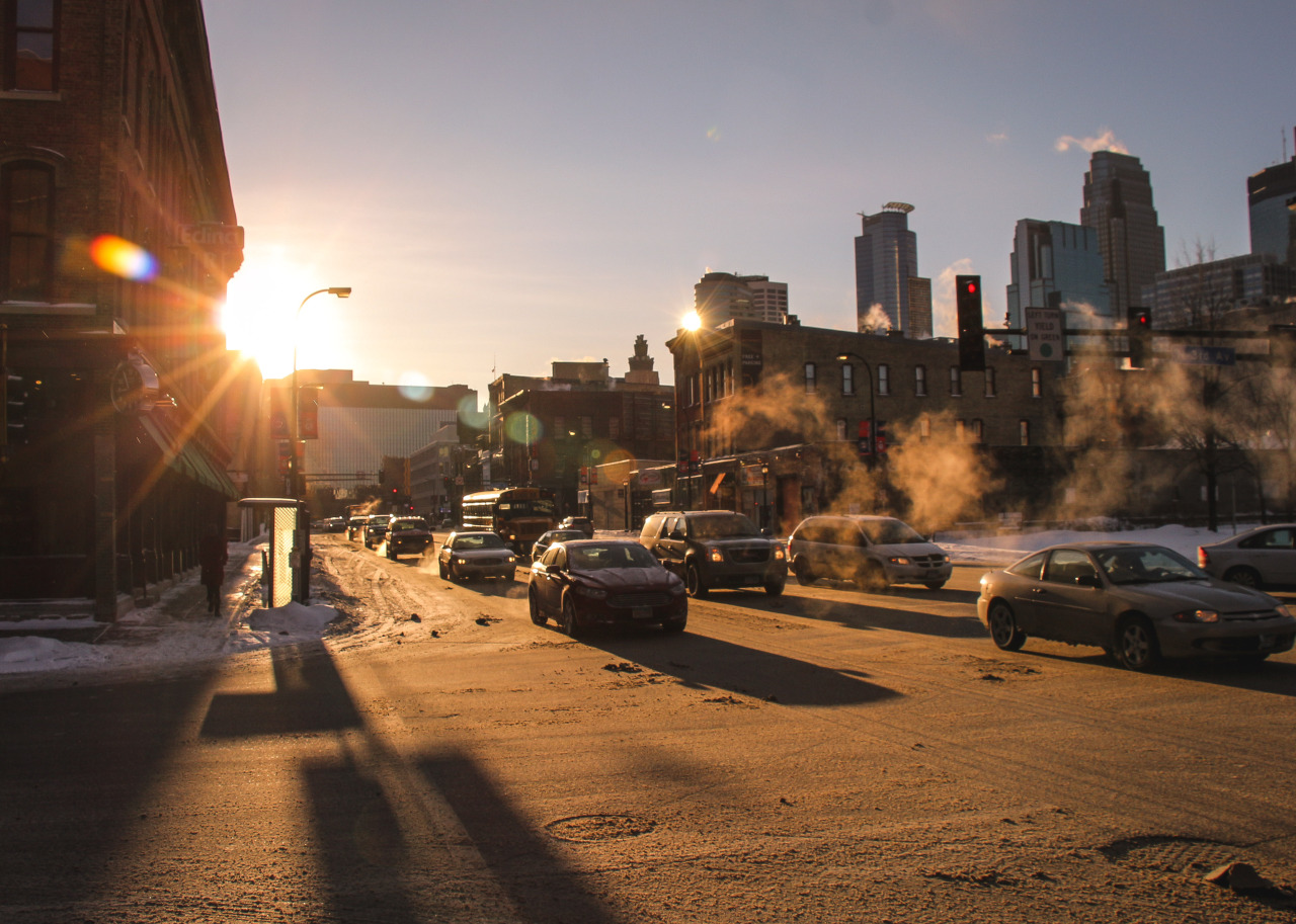
http://stuffaboutminneapolis.tumblr.com/post/108608019919

*** ***

http://bldgblog.blogspot.com/2015/01/colossal-cave-adventure.html


*** ***
http://www.vox.com/2015/1/13/7531833/road-salt-environment-alternatives


*** ***
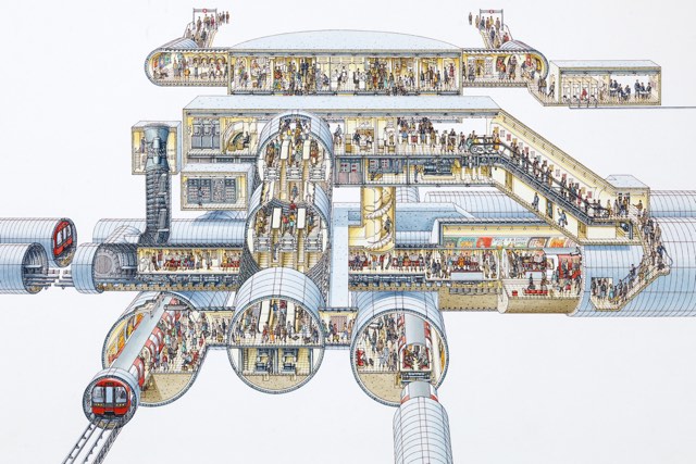
http://kottke.org/15/01/stephen-biestys-incredible-cross-sections

*** ***
https://twitter.com/StribRoper/status/558039447040954370


*** ***
http://thenewinquiry.com/essays/anatomy-of-a-dissection/


*** ***
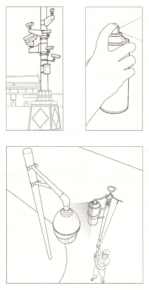
http://www.brainpickings.org/index.php/2013/07/31/ai-weiwei-cctv-camera-do-it/


*** ***

*** ***
http://www.minnesotamonthly.com/media/Minnesota-Monthly/January-2015/Future-Twin-Cities-Predictions/


*** ***
http://news.nationalpost.com/2015/01/17/toronto-skylines-absolute-transformation-captured-by-two-photos-taken-13-years-apart/


*** ***


*** ***
http://www.huffingtonpost.com/2015/01/14/most-popular-cuisine-state_n_6457252.html


*** ***
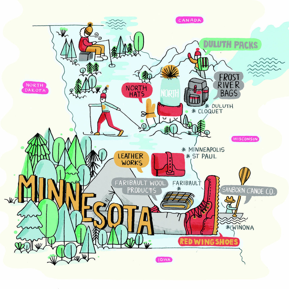
http://stuffaboutminneapolis.tumblr.com/post/108788742109/minnesotas-new-cool-image-as-the-north


*** ***
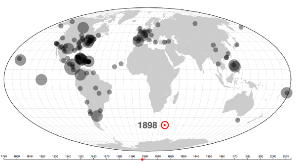
http://www.theatlantic.com/features/archive/2015/01/mapping-the-state-of-the-union/384576/


*** ***
http://www.datainnovation.org/2015/01/visualizing-countries-populations-by-age/


*** ***
http://www.bostonglobe.com/metro/2015/01/20/boston-where-parking-scarce-but-parking-permits-are-free-and-unlimited/pxiGojsGYC3Ae5LYwpwBRK/story.html?event=event25


*** ***
http://www.ritholtz.com/blog/2015/01/a-visual-map-of-the-history-of-jazz/


*** ***
http://motherboard.vice.com/read/is-simcity-homelessness-a-bug-or-a-feature


*** ***

*** ***
http://mentalfloss.com/article/49039/9-houses-built-just-spite


*** ***

*** ***

*** ***


*** ***
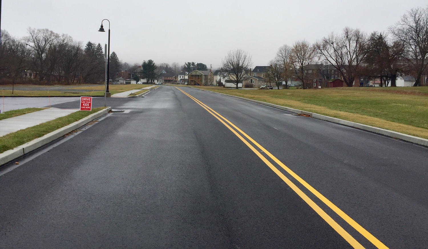
http://www.strongtowns.org/journal/2015/1/19/drive-like-your-kids-live-here


*** ***


*** ***


*** ***


*** ***


*** ***
http://curbed.com/archives/2015/01/20/detroit-brodhead-naval-armory-interior.php


*** ***
http://borderbedazzler.blogspot.com/

*** ***
https://www.facebook.com/photo.php?fbid=10102028915788447&set=a.10101101120787067.1073741826.15620710&type=1&theater


*** ***

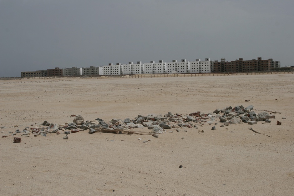
http://www.citylab.com/housing/2015/01/fighting-a-housing-crisis-egypt-builds-towers-in-the-desert/384728/

*** ***
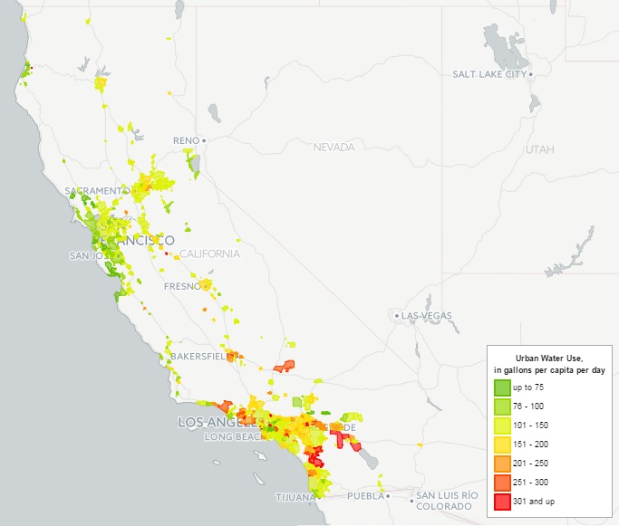
http://pacinst.org/publication/interactive-map-of-californias-urban-water-use/


*** ***
http://www.washingtonpost.com/blogs/wonkblog/wp/2015/01/16/quiz-can-you-name-these-cities-just-by-looking-at-their-subway-maps/?Post_generic=%3Ftid%3Dsm_twitter_washingtonpost


*** ***
http://curbed.com/archives/2015/01/21/crowded-hong-kong-cemeteries-photos.php


*** ***
http://kottke.org/15/01/crazy-whirlpool-traffic-interchange-in-dubai


*** ***
http://www.citylab.com/commute/2013/12/what-your-street-grid-reveals-about-your-city/7746/


*** ***


*** ***

https://www.facebook.com/danielellsworthandthegreatlakes/photos/a.10150103957291833.301545.20857051832/10153134237836833/?type=1&theater

*** ***
http://www.peopleforbikes.org/blog/entry/how-montreal-built-a-bike-lane-by-debunking-fears-of-autoparkolypse


*** ***
https://twitter.com/PoIiticalLine/status/557596704514793472

*** ***

http://usa.streetsblog.org/2015/01/07/as-protected-bike-lane-design-evolves-new-lessons-emerge/

*** ***

https://twitter.com/MattBruenig/status/557628236671483904


*** ***
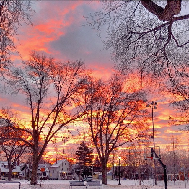
http://stuffaboutminneapolis.tumblr.com/post/108934238739/santaerik-alright-already-heres-my-sunrise


*** ***
http://stuffaboutminneapolis.tumblr.com/post/108934261354/84ability-saint-anthony-falls


*** ***

http://photos.twincities.com/2015/01/16/the-st-paul-winter-carnival-in-the-1880s/#1

*** ***
http://curbed.com/archives/2015/01/16/shop-architects-skinniest-tallest-skyscraper.php


*** ***
https://www.facebook.com/oldmpls/photos/a.119636488056535.13615.119633278056856/871998079487035/?type=1&theater