Well, the last of the big four Minneapolis architectural projects opened last weekend when the new Guthrie Theater held public and private open houses. You wouldn’t know it from the press coverage, but most of people I’ve talked to consider the building to be the most controversial (though not the ugliest) of the four big Minneapolis projects (the others being the MIA expansio n, the Walker, and the downtown library). I’m not one to rain on parades willy-nilly, but hardly anyone I know liked the building.
“Look! A new Ikea,” said my girlfriend.
“It’s exactly like the Mall of America,” complained my architect friend.
“A bit blue, isn’t it?” asked my coworker.
“The Guthrie hasn’t been interesting since I was in grade school,” said an actor I know.
“The thespian death star has arrived,” was my only thought.
No, wait, I just thought of another . . . “It’s a 21st century melodrama factory.”
Granted, no matter what the architecture, the new Guthrie building is replacing one of the still-too-common surface parking lots downtown, and it’s a net plus. But I get a little tired of the Twin Cities media’s typically cloying attitudes towards local institutions (e.g. Target, MPR, any sports franchise).
I want to discuss the pros and cons of the new building, because I think it’s the most outrageous and interesting of the new projects. Furthermore, I think it’d be helpful to take a look at all the big new “public” building projects in the Twin Cities, and ask whether or not they work to make our town’s streets more interesting, livable, and vibrant.
Strength #1. Building as BillboardFrom a distance, the Guthrie looks good. It has two “smokestacks” that serve as changeable message signs, a la Jenny Holzer. Though, so far they’ve only displayed the name of the next play and a pixilated image of some playwright’s profile. (The Guthrie could learn a thing or two from Target’s endlessly fascinating downtown headquarters, which changes it’s colored lights almost randomly). The building’s yellow-tinted windows glow from the inside. The building serves as a giant billboard for the Guthrie Theater, in much the same way as the next-door Gold Medal Flour Grain Elevator’s rooftop neon sign advertises its flour.
The building is also a rather sly comment on the Mill District aesthetic. Its Eastern wall is solid and unbroken, and towers over the street in exactly the same way that the next-door flour mills do (albeit more bluely). And, from across the river, the Guthrie fits nicely into the line of large industrial era buildings along the river – the Whitney Hotel building (now condos), the Ceresota mill condos, the Mill City museum, and the Gold Medal Flour mill (also condos).
As part of the Minneapolis skyline, the Guthrie strikes a modern pirouette in the long-abandoned Downtown East area. I’d say that it fills the giant Metrodome-shaped gap between the city hall and Gehry’s Weisman Art Museum, and for that we can be thankful.
Strength #2. Views of the CityCoverage of Minnesota in the national newsweeklies is rare, so I guess we should be happy that the Guthrie headlined Minneapolis’s mention as part of “The Design Dozen.” According to the magazine, French architect Jean Nouvel persuaded reluctant Guthrie officials to build the theater fifty feet off the ground by lifting them up in a cherry-picker so that they could see the prospective river perspective.
Perhaps he also threatened to throw them from the upraised basket unless they agreed to his plans, but somehow the new Guthrie stage is indeed elevated fifty feet in the air, and features the largest escalator in the state.
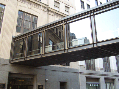
After one escalates up, one can saunter out onto the Guthrie’s House on the Rock-style cantilevered bridge, and the views of the city and the river are wonderful. If it were a public space, it would make an excellent firework vantagepoint, a good stroll locale, or a nice place to make out.
The building also gets points by orienting itself toward the river It’s curved entrance beckons people toward the riverfront, and the famous Stone Arch Bridge, and it marks one more big step toward turning the Minneapolis riverfront into a much-needed public, green space. Now, all we need is to get rid of the Lock and Dam.
Strength #3. UniquenessEven if you hate the building, there’s no denying its uniqueness. Though metallic cladding isn’t really unusual (e.g. Weisman, Walker), a building this dark and blue is something new. Not only that, but the large design is chock-a-block full of gimmicks like the bridge to nowhere, the dual LED smokestacks, protruding upside-down terraced theater seats, and the yellow-tinted windows that remind me of a space-age Lego set.
Given today’s tight competition for the entertainment dollar, having such a distinctive building is a real asset for the theater company, and the city. It will no doubt be featured in many more magazines and industry rags.
Weakness #1. In-Human Scale Theater, as oppose to the movies, is all about intimacy. Theater lovers often claim, rightly, that nothing can match the personal connection of live performance. This is particularly true for the Guthrie, whose trademark is its thrust stage that puts the performers right in the middle of the audience. That’s why it’s so strange to see a great behemoth of a theater, towering hundreds of feet into the air.
Large theaters are nothing new. The golden ages of vaudeville or movies had their giant theaters, some of which still exist along Hennepin Avenue. The Goodman Theater in Chicago is really big, and, like the new Guthrie, has many different theaters inside one building.
But, to me, the new Guthrie building is just too big. It’s like the mega-mall. I wouldn’t be surprised to learn that it’s a theater factory, storing performances of The Christmas Carol for shipment to audiences all over the world. It’s so big, it blocks out the aforementioned Gold Medal Flour sign from most compass points, rendering the last historic remnant of the Mill District useless. What could possibly justify a twelve-story theater? Is Paul Bunyan one of their actors?
Not only is the theater too big, the parking lot is just as large. And its placement between Washington Avenue and 1st Street erects a large barrier between the theater and the surrounding community. It would have been nice if the Guthrie could have found room in their budget for underground parking, and retained the space on the adjacent block for residential and commercial development.
Weakness #2. Inward FocusIt’s likely that, if you turn around inside the new Guthrie, you will be met by a well-stocked bar. Or, perhaps, a café … or at the very least, a gift store. That’s because, much like the Mall of America or the international airport, the new Guthrie is a self-enclosed retail environment. The famously long escalator deposits you in a consumer paradise, and you are delighted to spend your entertainment dollars within its confines.
Granted, the Guthrie’s new M. O. is hardly different than other Twin Cities artistic establishments. I’m thinking of the Guthrie’s Wolfgang Puck franchise, the Prairie Home Companion retail store, or even a hot dog at the new publicly subsidized Twins stadium.
The real problem is that the Guthrie wants nothing to do with its neighborhood. When one goes there, one parks in the blue-clad Guthrie parking lot, takes the Guthrie skyway over to the theater, enjoys a glass of Guthie merlot and a Guthrie-cooked meal before walking across the Guthrie cantilevered bridge to view the distant city. The entire project displays an inward focus, directing its patrons inside the building in much the same way that the Mall of America intends shoppers to spend time at what was formerly called Camp Snoopy. Perhaps theatergoers will be tempted to stop by Grumpy’s Bar on Washington Avenue, or visit one of the new restaurants in the now-booming neighborhood. But if they do, it will be despite the best intentions of either the architect or the marketing divison.
In my worst moods I start to think that, with MPR leading the way, Minnesota has set the industry standard in sell-out artistic endeavors. It seems like every cultural institution in this town needs to embrace the most middling form of capitalism in order to pursue some sort of Machiavellian growth strategy. In bad dreams, this new theater factory along the Mississippi portends an aesthetic apocaplypse.
Weakness #3 Uniqueness?As much as I credit Mr. Nouvel for his originality, the Guthrie has all the subtlety of a daytime soap opera. Instead of one scrolling LED smokestack, the new Guthrie has two. And one of these smokestaks features a blinking red light – to ward off airplanes? In addition to elevating the theater 50 feet into the air to garner a good view, the new Guthrie features a protruding bridge that resembles the “skyways to nowhere” that poke out of each downtown’s forgotten office buildings. In addition to being gargantuan, the new Guthrie is clad in dark blue metal, through which bright yellow plastic windows lite up the night.
OK. I get it. The architect is French! The building looks like some science fiction warship you’d see threatening Scott Bakula on the UPN. If it were small and blue, lost a smokestack, and got rid of either the yellow windows or the cantilevered bridge, it might be tasteful. But the new building is nothing short of gauche.
Verdict: Good for theater, not that helpful for Minneapolis’s city life.
Minneapolis has always had an unhealthy obsession with futurism. One could argue that it hearkens back to the city’s name – that silly fusion of the Greek
polis and the Ojibwe
minne, with a helpful “a” thrown in for readability. The new Guthrie takes this breakneck idealism to its utmost, one-upping not just the Walker, but the actually revolutionary Weisman just across the river.
One could argue that classical art forms like the theater, the opera, or the symphony are slowly dying at the hands of convenient electronic entertainment. One could argue that these bits of culture need all the help they can get to compete in today’s marketplace, and if that marketplace demands a blinking, doodad-filled, Godzilla-sized metallic whatsit, then that’s the price of cultural capitalism. Meanwhile, those of us that know better will keep going to the Jungle or the Southern, or the Red Eye theaters to see better plays, in neighborhoods and buildings that better fit the human body. I’d bet that because of the size, scope, and exclusivity of the new Guthrie building, the surrounding Mill District won’t see much of a benefit from having the Guthrie in its midst. That doesn’t affect my excitement at seeing parking lots transformed into new, dense residential and commercial spaces. But it does leave me with a tinge of disappointment.
On the other hand, maybe I should go see a play there sometime . . .
P.S. Fun Fact!Guthrie architect Jean Nouvel also designed the Bobby & Steve's Auto World on Washington Avenue.
Super Update:
Apparently, the New York Times
likes the Guthrie more than I do!
 Hot on the heels of my last post about increasing homogeneity and class segregation in US metro areas, here’s something that’s bucking the trend...


